

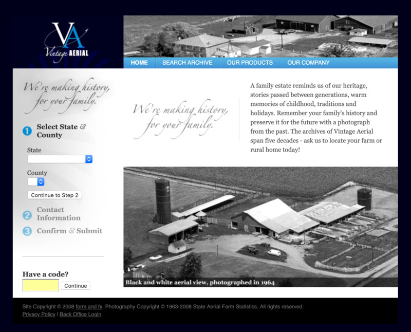
In the early days of Vintage Aerial, we were eager to begin unveiling our collection to the world. Constrained by limited resources, our founding members used their knack for agile development to build a website that accomplished our most basic objective – to display online photographs that had been trapped in analog rolls of film for nearly 50 years.
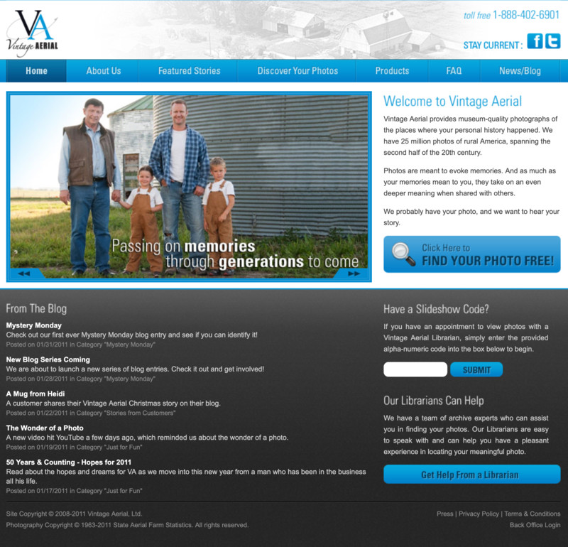
We’ve spent the ten years of our existence converting analog film to digital images, and creating architecture that catalogs a vast and complicated collection while making it easily accessible to all. We have done that, and so much more, in furtherance of our mission to collect and present aerial photos of rural America in a way that evokes personal, family, and community memories and that encourages the sharing of our common history.
|
|
|
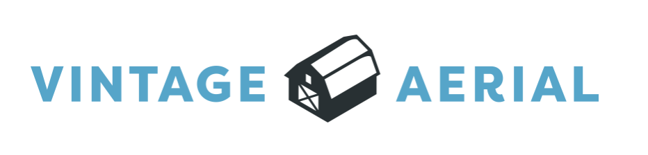
As our small team reflected on where we’ve been and where we’re headed, we concluded it was time to revisit our logo and our look and feel to ensure the align with our mission, our core values, our current state, and our future. By design, our brand has always been simple and unobtrusive, in keeping with our belief that the life of our company rests in our unique and meaningful content. But as we have worked, we have evolved, and we wanted to develop a brand that more closely matches and expresses who and what we are, and what we offer to you, to the world.
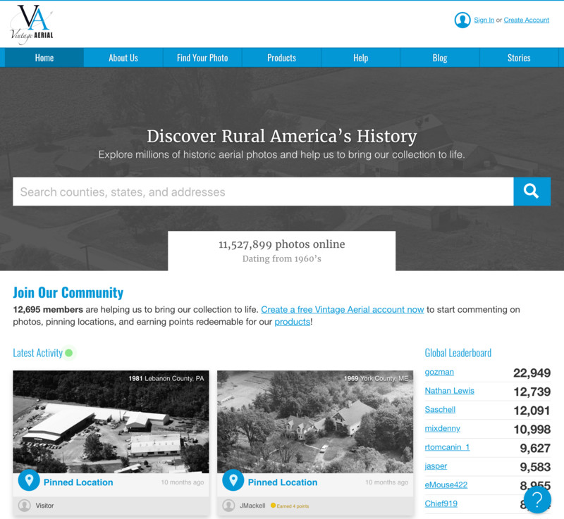
We believe we have the largest single-subject archive of photographs anywhere in the world: 23 million photos of rural homes and farms. And if one thing comes to mind when you think of a farm, there’s a good chance it’s a barn. It’s a simple image, but it’s a profound symbol.
|

Visitor Comments
Excellent choice for your logo. Looks good small or large. Fits the brand and evokes its product very well.
Also, Lance, if you could please reply to my email, that would be nifty.
Nice logo. It explains your business very well.